
Designing Landing Pages for Public Booking Links [Expert]
Reduce booking friction: Designing Landing Pages for Public Booking Links - microcopy, forms & mobile UX that boost conversions. Read the expert analysis
Introduction
When a public booking URL must carry the weight of scheduling and conversion without an authenticated context, landing page design becomes a high-stakes exercise in clarity, trust, and efficiency. Business professionals must reconcile marketing-level simplicity with operational requirements—collecting enough data for scheduling while keeping abandonment low.
This guide explains how microcopy, form strategy, and user experience (UX) patterns work together to reduce friction on public self-booking landing pages, with practical checklists and measurable KPIs.
Quick answer: Use concise microcopy, minimize required fields through progressive disclosure, surface security and social proof, optimize CTAs for intent, and instrument A/B tests on headline, form length, and CTA to measure a lift in completed bookings.
Why public booking links require different landing pages
Public self-booking links are often clicked from emails, ads, or social profiles where users do not have an account or prior session. That distribution context changes expectations and introduces friction points not present in authenticated flows.
- Users lack stored context: no saved defaults or credentials; onboarding must be short and meaningful.
- Trust and privacy concerns increase because users may be sharing sensitive details without an account.
- Device diversity: many clicks originate on mobile devices where screen space and attention are limited.
Design decisions must therefore compensate for missing context with clarity, reassurance, and rapid task completion.
Microcopy: words that reduce friction
Microcopy is the small text—labels, field hints, CTA labels, error messages—that guides micro-decisions. Well-crafted microcopy reduces cognitive load and prevents users from guessing intent.
Tone and clarity
Best practices for tone and clarity:
- Be explicit about what will happen next (e.g., "You will receive a confirmation email with a calendar link").
- Prefer verbs that describe outcomes over ambiguous terms (use "Schedule meeting" vs. "Submit").
- Match formality to audience: professional tone for B2B, concise friendly tone for B2C.
Field-level help
Field-level hints and placeholders cut friction by reducing errors:
- Place a succinct hint under fields that commonly confuse users (e.g., "Use company email to reserve enterprise slots").
- Avoid putting critical information inside placeholders that disappear when users type.
- Use optional/required indicators consistently; explicitly label optional fields to justify longer forms.
Error messaging
Errors are opportunities to retain users if handled clearly and quickly:
- Show contextual, inline error messages next to the offending field.
- Explain how to fix the issue (e.g., "Enter a valid phone number: +1 555 555 5555").
- Minimize alarmist language; prefer constructive guidance.
Quick answer: Use precise outcome-focused CTA labels, visible field hints, and inline, actionable error messages to reduce abandonment at the microcopy layer.
Forms: best practices for self-booking flows
Forms are the friction hotspot on booking landing pages. Optimize structure, length, and validation to cover operational needs without scaring users away.
Progressive disclosure
Progressive disclosure reduces perceived form length while collecting necessary information:
- Ask only what is required to confirm a booking in the first step (name, email, time slot).
- Request additional details (phone, company size, meeting agenda) on a second step or after the booking is tentatively created.
- Use conditional logic to reveal fields only when relevant (e.g., show "Company" only when "Work" is selected for email type).
Security & trust signals
Public booking flows must proactively earn trust to reduce drop-offs:
- Display a non-invasive trust line (e.g., "We’ll never share your data; see our privacy policy") near the submit action.
- Use familiar payment or authentication badges if relevant for paid bookings.
- Provide an explicit privacy or data usage link in small text—do not hide core commitments in long policy pages.
Validation and inline feedback
Rapid, inline validation prevents user frustration:
- Validate formats (email, phone) as users type, not only on submit.
- Offer real-time availability for time-slot selection to avoid conflicts.
- Keep validation messages human-readable and actionable.
Quick answer: Start with a single-step booking capture for essential fields and defer optional information; add clear trust signals and inline validation to keep completion rates high.
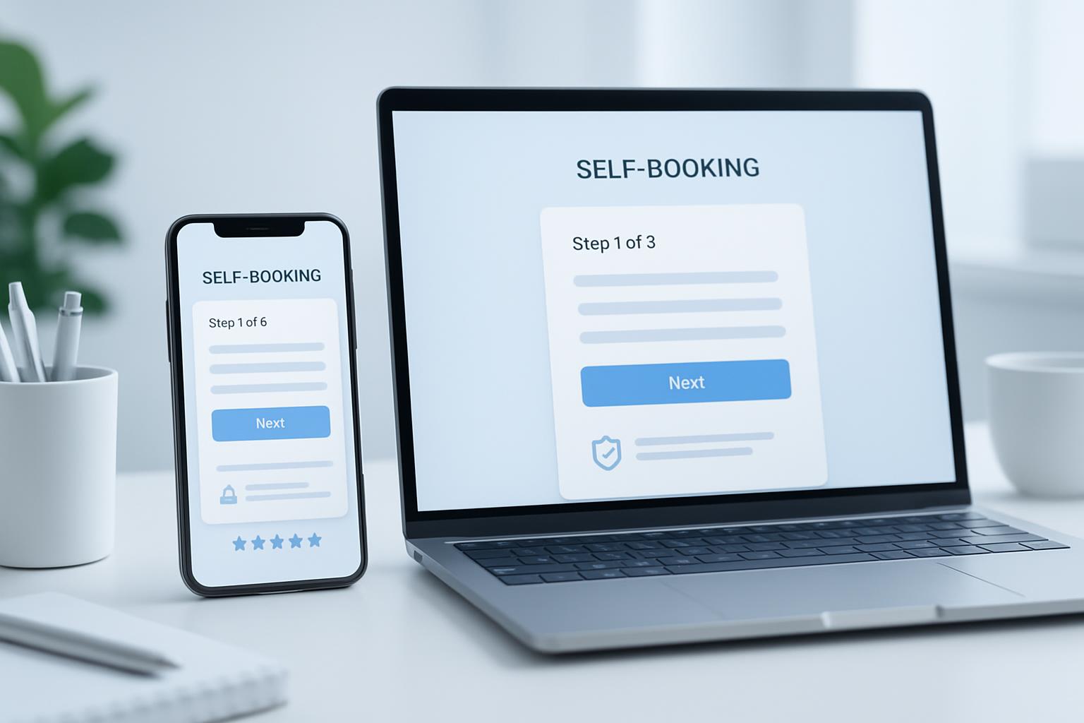
UX patterns and layout
Layout and interaction design determine whether microcopy and forms can do their job. Prioritize hierarchy, visual clarity, and mobile ergonomics.
Mobile-first considerations
Most public booking clicks originate from mobile; design for thumbs and small screens:
- Use single-column layouts and large tappable targets (44–48px minimum).
- Place the primary CTA within easy reach (bottom of viewport for long forms).
- Optimize keyboard behaviors for inputs (numeric keyboard for phone, email keyboard for email fields).
CTA design and prominence
CTAs must communicate intent and confidence:
- Use a single dominant CTA per page with a clear outcome label (e.g., "Confirm meeting — 30 min").
- Complement primary CTAs with low-friction secondary actions (e.g., "Request alternative times") instead of multiple primary buttons.
- Test color and copy variations; ensure color contrast meets accessibility standards (WCAG 2.1).
Loading states & feedback
Provide immediate, understandable feedback for asynchronous actions:
- Show inline spinners or skeleton states when checking availability.
- Confirm success with a short visual state and next steps (calendar attachment, add-to-calendar link, cancellation/reschedule options).
- Keep messages on-screen after submission; avoid redirecting users without confirmation context.
Testing and analytics
Instrument every landing page to learn what reduces friction and what increases abandonment. Tracking informs pragmatic iteration.
Metrics to track
Prioritize funnel-level and micro-conversion metrics:
- Visit-to-start rate: percent of visitors who engage with the booking form.
- Start-to-complete rate: percent who finish booking once they begin the form.
- Time-to-book: median time from landing to confirmation; long times indicate friction.
- Error frequency and field abandonment: which fields cause the most drop-offs.
A/B testing ideas
Common, high-impact experiments include:
- CTA label: outcome-focused vs. generic ("Schedule" vs. "Schedule a 15-min demo").
- Form length: single-step vs. two-step progressive disclosure.
- Trust signals: with vs. without privacy line or social proof.
- Microcopy variations: clarifying field hints vs. none.
Run tests for statistical significance and monitor secondary metrics (bounce, support requests).
Contextual background
This section summarizes behavioral and accessibility principles that underpin low-friction booking pages.
Behavioral economics and friction costs
Friction increases perceived effort and decreases conversion. Small barriers (extra fields, vague CTAs, confusing errors) cause disproportionate abandonment due to loss aversion and cognitive load (see research summaries from Nielsen Norman Group and Baymard Institute).
Accessibility and inclusivity
Accessible booking pages widen your effective audience and reduce support costs:
- Use semantic HTML and label elements so screen readers can parse the form.
- Ensure color contrast and keyboard navigability for users with motor or vision impairments.
- Offer alternative scheduling methods (email, phone) where possible for users who cannot use online forms.
Key Takeaways
Design priorities and accountability for public self-booking landing pages.
- Microcopy wins: clarity in CTAs, field hints, and error messages reduces cognitive load.
- Forms should be minimal by default; use progressive disclosure for optional or sensitive fields.
- Visible trust signals and inline validation preserve confidence for unauthenticated users.
- Mobile-first layouts and clear CTA prominence materially increase completion rates.
- Instrument the funnel and run A/B tests on headline, CTA, and form structure to drive measurable gains.
Quick answer: Optimize microcopy, minimize initial form fields, add trust signals, and test iteratively; these steps often yield double-digit improvements in completed bookings.
Frequently Asked Questions
Practical answers to common questions business professionals ask about designing public booking landing pages.
How many fields should a public booking form include?
Start with the minimum required to confirm a booking: typically name, email, and time selection. Any additional information that isn’t necessary for scheduling should be deferred to a second step or collected after the booking is confirmed.
What microcopy elements most reduce abandonment?
Clear CTA labels that communicate outcome, concise field hints that remove ambiguity, and inline error messages that explain how to fix issues are the most impactful microcopy elements.
Should I require account creation for booking?
Requiring account creation increases friction. If possible, allow guest bookings and offer account creation as an optional step after confirmation, or provide SSO options (Google/LinkedIn) for a smoother sign-up flow.
Which trust signals are most effective on public booking pages?
Short, specific privacy statements ("We will only use your email to send booking details"), recognizable company logos or badges, and brief social proof (number of customers or short testimonials) are effective without overwhelming the page.
How should I validate availability in real time?
Use asynchronous checks when the user selects a time slot and provide immediate feedback if a slot becomes unavailable. Reserve slots temporarily during the finalization flow to avoid race conditions and inform users when a selected slot is no longer available.
What are the fastest tests to run that often improve booking rates?
Test the CTA copy, the number of visible fields on the first step, and the presence or absence of a short privacy/trust line. These experiments are quick to implement and commonly produce measurable uplifts.
Sources: Baymard Institute research on form abandonment; Nielsen Norman Group guidance on microcopy and usability; WCAG 2.1 accessibility guidelines.
You Deserve an Executive Assistant
